Income adjustment
A country's income, development indicators and sovereign ESG scores are intricately connected. Without considering the role of income, using sovereign ESG scores could lead to unintended outcomes. This page discusses what this income bias is about, when it makes sense to adjust for it and allows you to explore the effect of income adjustments.

Correlation with per capita income -
adjustments
Highest and lowest scoring countries
| XX. | Highest | Value |
|---|
| XX. | Lowest | Value |
|---|
What is the "ingrained income bias"?
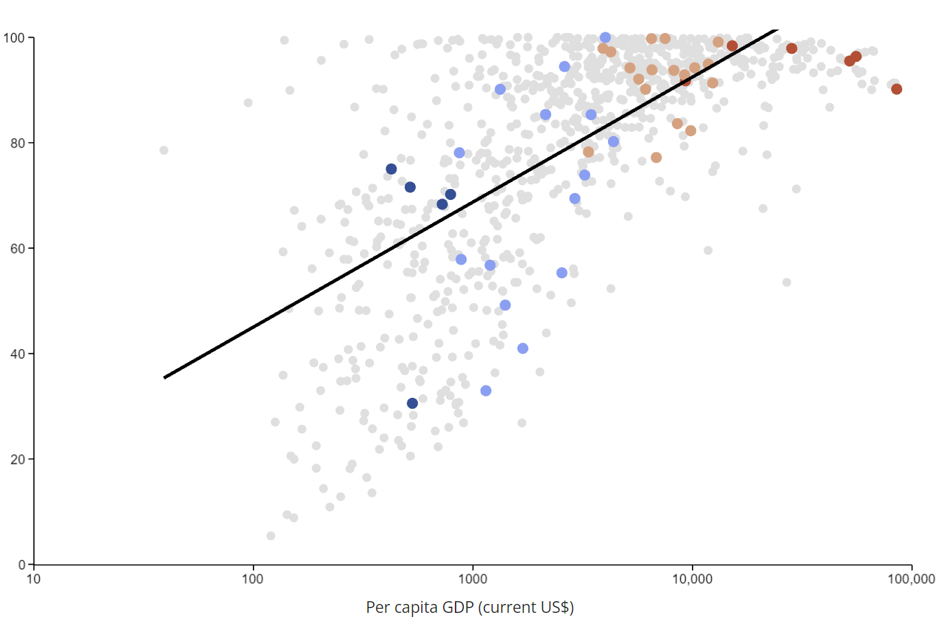
The ingrained income bias (or simply "income bias" or "wealth bias") is the phenomenon that sovereign ESG indicators of richer countries tend to be higher while those of poorer economies tend to be lower. In other words, sovereign ESG indicators are highly correlated with a country's income. In the graph below, we proxy income with a country's per capita GDP (in current US$) on the horizontal axis.
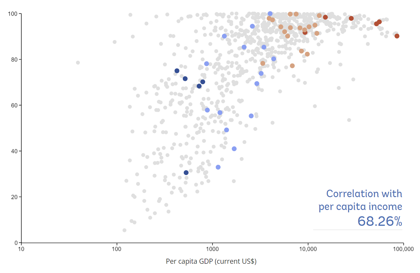
As the graph shows, it's generally not true that richer countries always have higher ESG scores than poorer countries. But the black line shows a clear upwards trend -- the higher the per capita GDP, the higher the literacy rate. The crucial issue here is that it isn't clear whether countries are rich because they have high literacy rates or they have high literacy rates because they are rich. In fact, a third option exists where both are due to the fact that a country is developed.
Why is it called a bias?
One may question the term "bias" since measuring the literacy rate is a measurement. The issue arises, however, when sovereign ESG scores are interpreted and used as metrics for sustainability or investment impact. This is particularly pernicious when investment portfolios are constructed based on sovereign ESG scores thereby giving countries with better ESG scores a larger share of their portfolio. The rationale behind this allocation decision appears intuitive: The higher a country's ESG scores, the more capital should be allocated. However, following this recipe may not lead to the intended outcome and achieve the opposite. If it is true that sovereign ESG scores tend to be higher for richer countries, then investing based on sovereign ESG means investing in rich countries — because their literacy rate is already high or their rule of law is already strong. Consequently, capital would be diverted towards richer countries and away from poorer countries, where most investments are needed.
How can we account for the bias?
Recognizing the issues with using sovereign ESG scores directly to guide investments, the logical question is how one can account for that. Several methods exist, ranging from simple min-max rescaling to advanced statistical models. The central question here is the justification for choosing a particular adjustment method.
Linear income trend
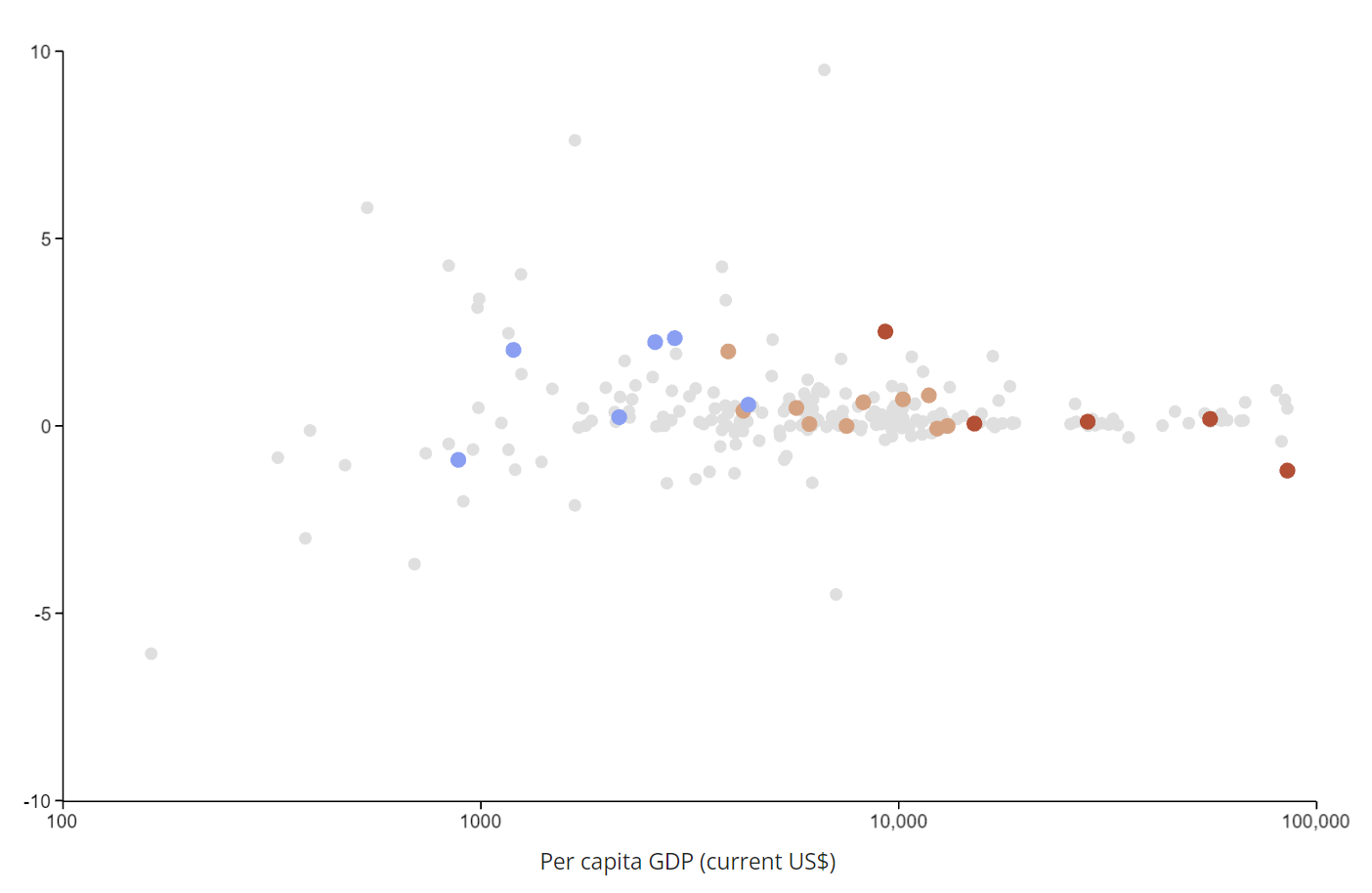
An intuitive way to mechanically remove the correlation with income is to estimate the linear income trend (a regression on income) and subtract it from the data. Doing so ensures that the results are by construction uncorrelated with income. You can try this by selecting Adjust under LINEAR INCOME TREND. This eliminates the correlation with income in all cases. However, the assumption is that the relationship between ESG scores and income is always linear. While this may work for some cases, this assumption simply cannot be defended in other cases. For instance, take access to electricity (% of population). The linear income trend method would predict population shares that are negative or above 100%.
Momentum
Another way to overcome the effect of income is to look at recent developments. Since the income or development level is not changing rapidly — especially not from one year to another — one could treat it as fixed. The de facto constant income component is eliminated by computing the first difference or the growth rate.
In addition to adjusting for the income effect, the momentum approach shows us in which direction the country is developing. This could be particularly interesting for countries that have significant room for improvement. However, sudden changes after periods with almost no changes may quickly lead to outliers.
Income peers groups
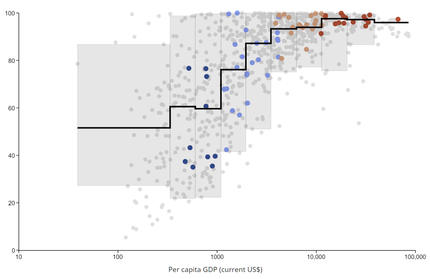
Finally, a simple and robust way to compare countries on a level playing field is to form income peer groups. Dividing the income axis into deciles leads to the formation of ten groups. Members of the same group have similar levels of income and resources. A country scores high if its literacy rate is close to its group's historical top performers. In other words, countries are not assessed on a global standard, but on an income dependent standard. The richer the country, the higher its income decile, the higher the assessment standards. In the graph these standards are characterized by the black line, which shows each group's median literacy rate while the grey boxes stretch between the minima and maxima, excluding outliers.
For more details we refer the reader to an upcoming background report on the new data portal.